Modulor 2.0

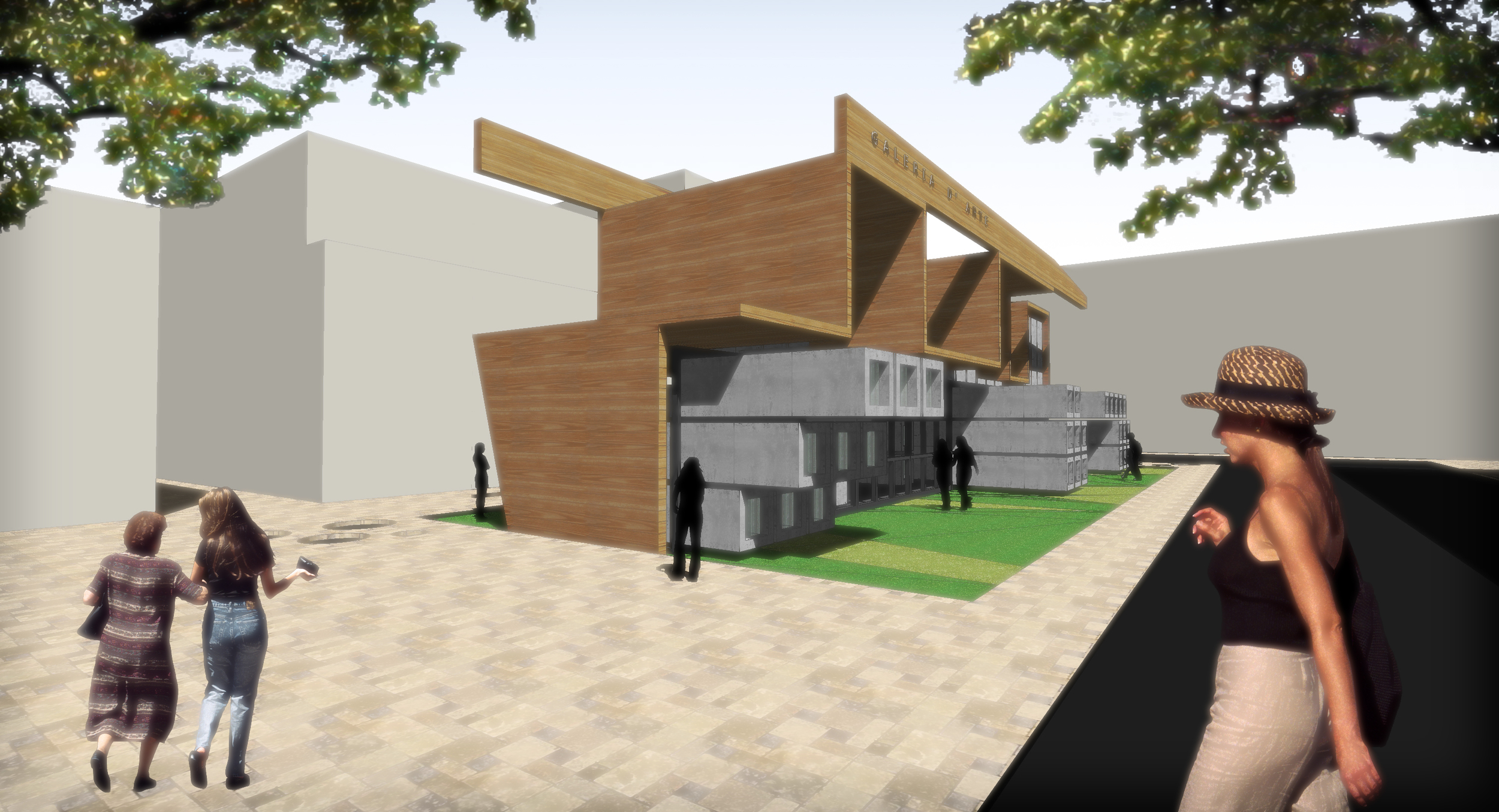
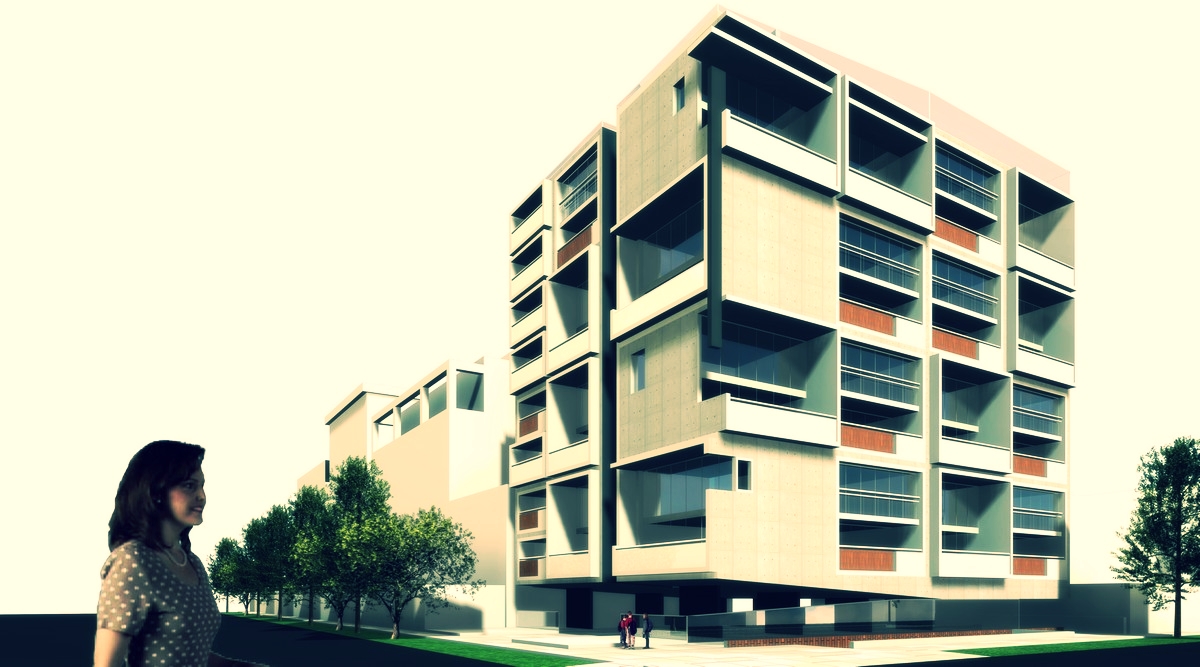
In 2007, I was summoned for a design competition. The competition was simple: To design a building for a Real Estate Company in Lima, Peru, in such a way that it allowed a progressive investment. The Lot was given and the Program was given.

The first idea that came to mind when talking about modules and progression was Le Corbusier´s Image of him inserting a cube on his 1947 “Plug-in concept”, for the Untite d´Habitation…What if one could ACTUALLY do that?

Le Corbusier Unite d´Habitation ... Image from the WWW.

Le Corbusier Unite d´Habitation ... Image from the WWW.

By creating a 3d grid and designing modules that could be built elsewhere and inserted into this grid via a construction crane several things may happen in terms of architecture and the business of selling buildings:

1.       The investment could be controlled by actually building what you sell…when you sell it.

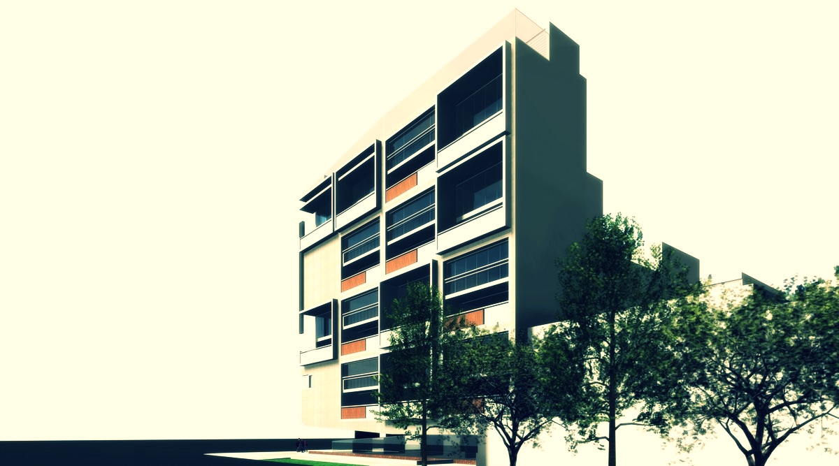
2.       You could create different façades… Actually the façades would create themselves as one sells the units.

3.       The spending could be allocated towards the common areas creating a building that looks finished even if it´s not…

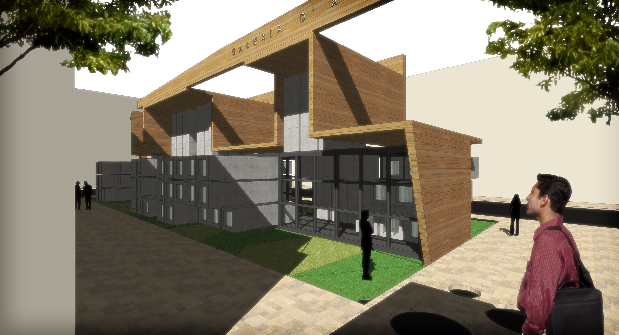
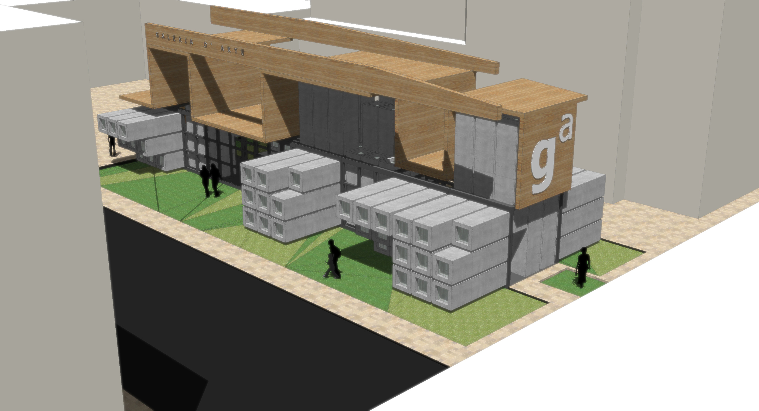
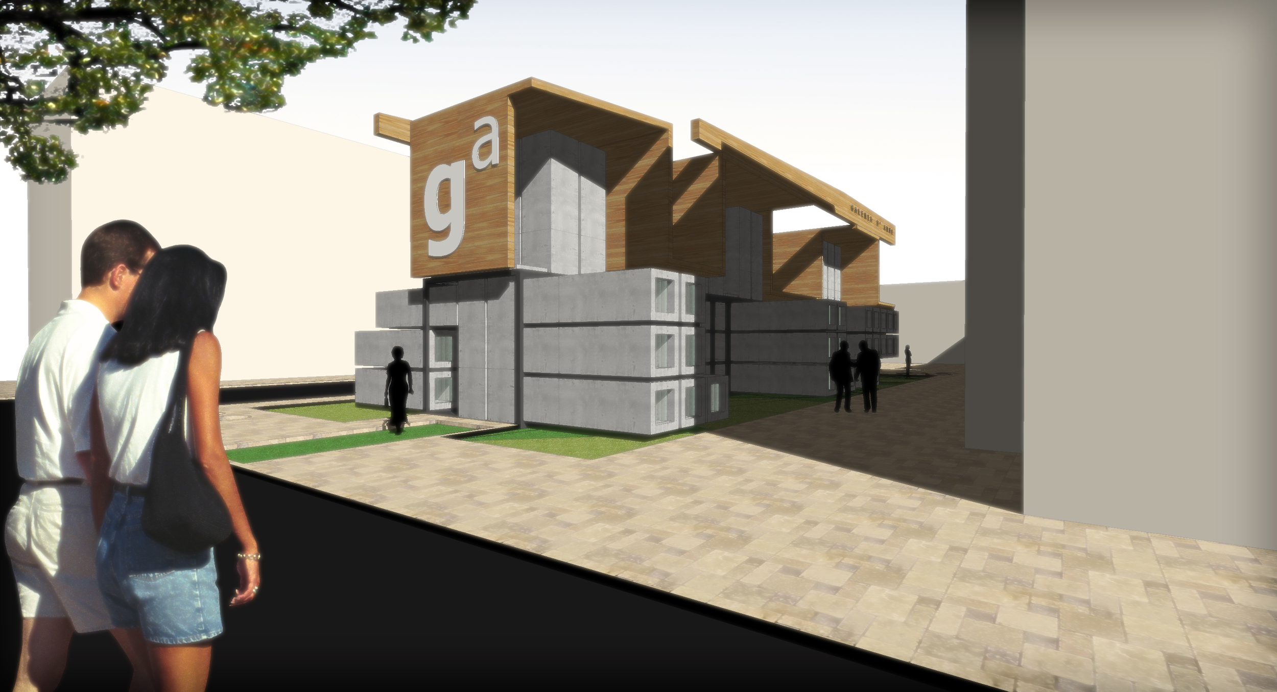
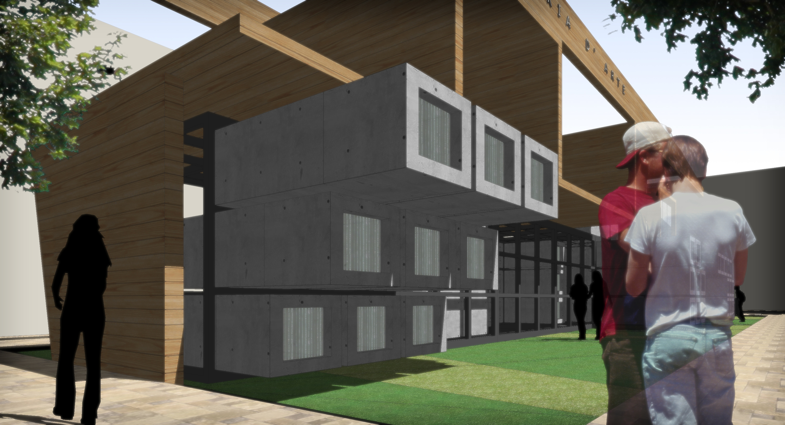
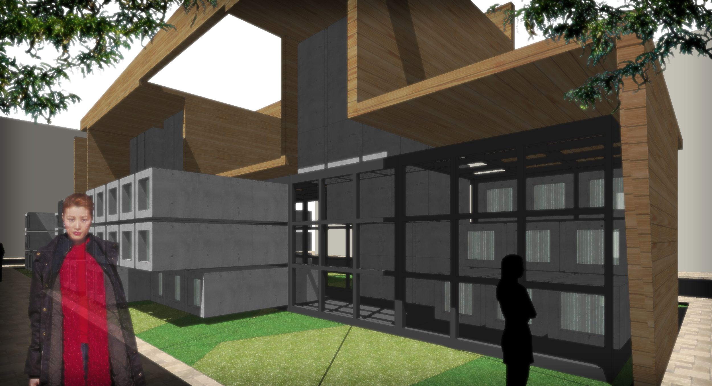
The answer became in the form of a new concept: Modulor 2.0. A simple but complex module system that would accompany the real estate business, creating architecture along the way, as the business is completed...thus lowering the risk of investment and creating different and interesting architecture along the way.

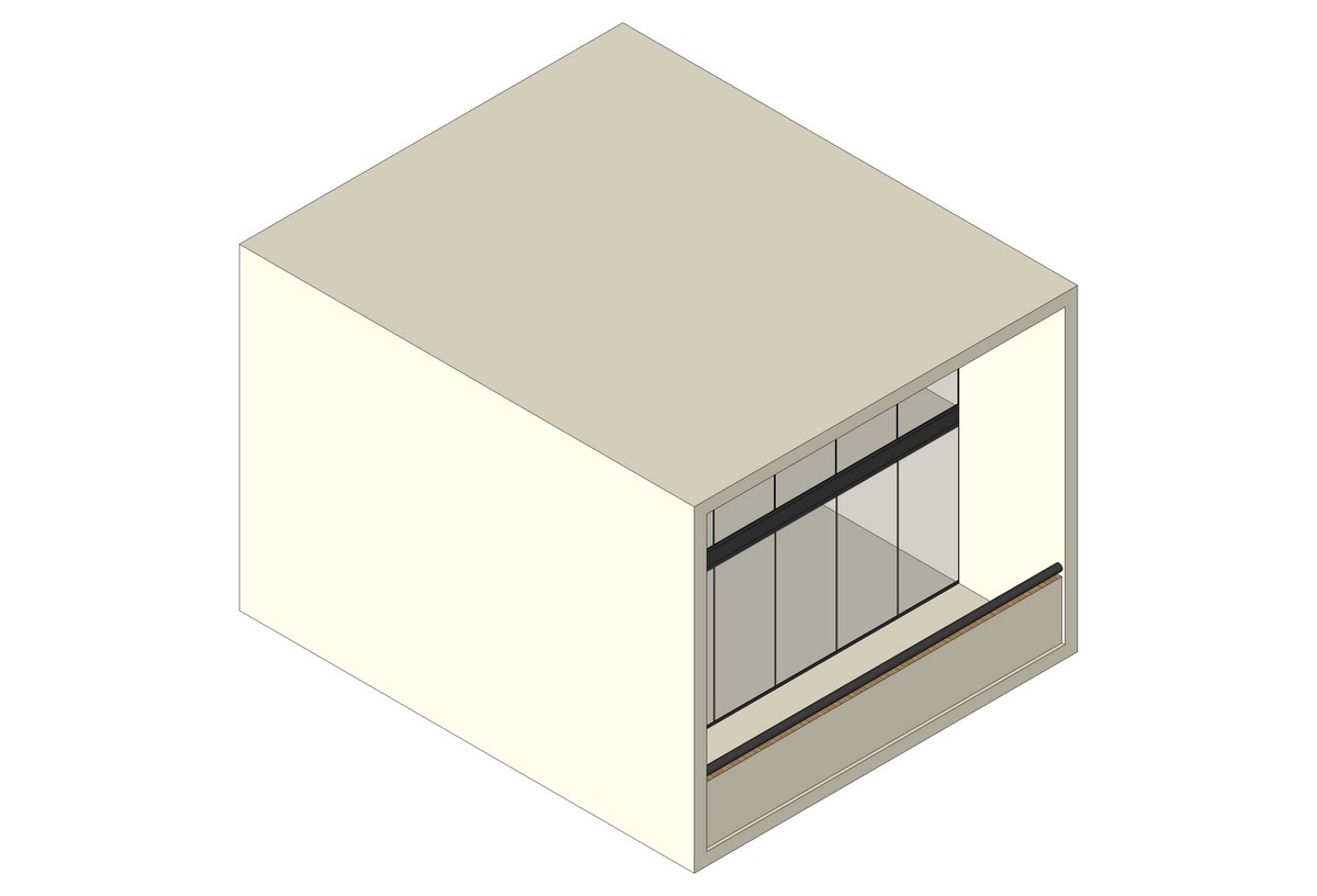
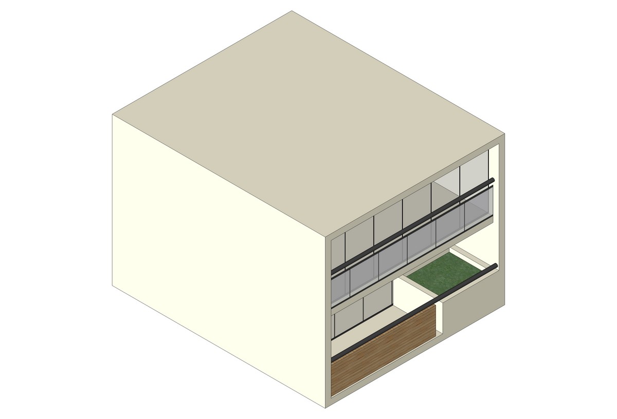
Above you can see the housing module being inserted into the grid.

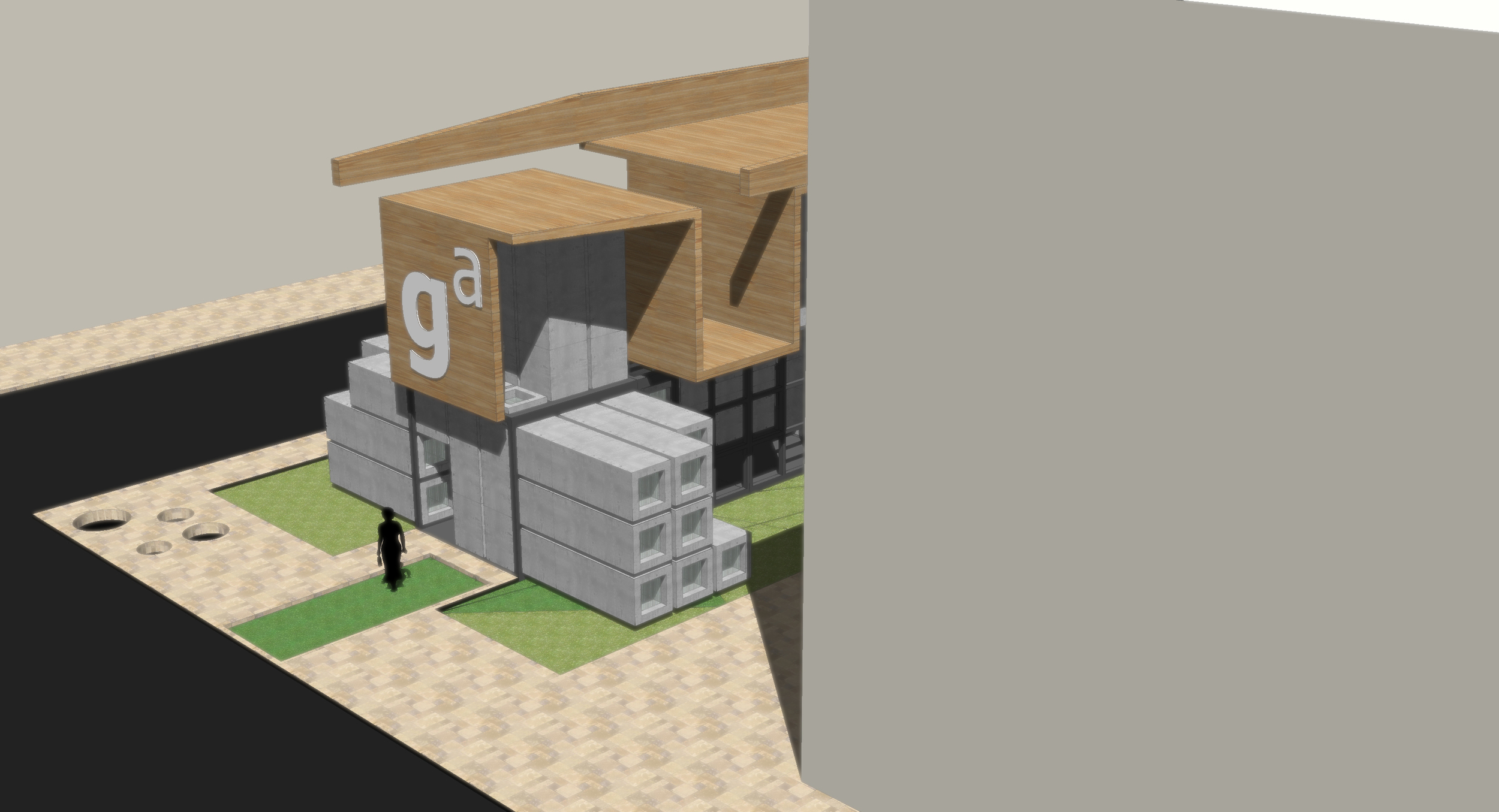
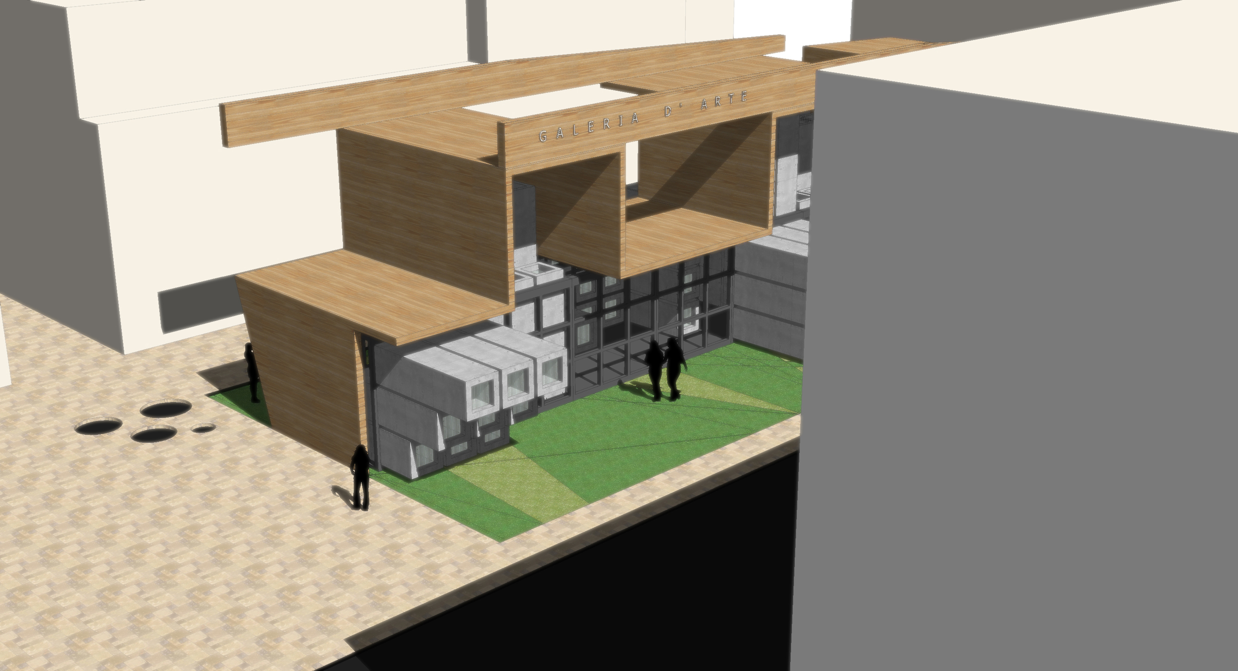
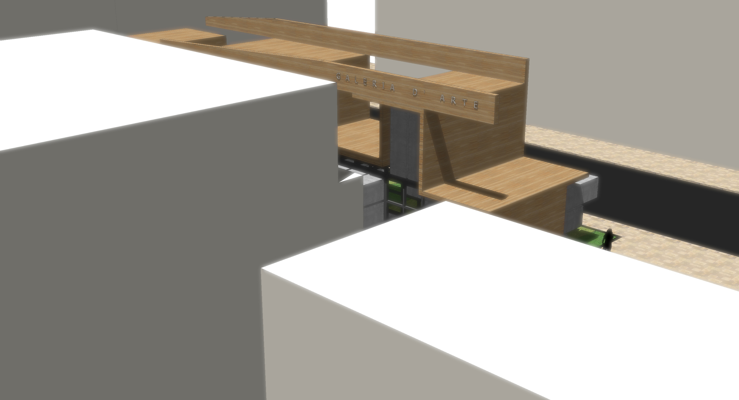
Volume studies for the main grid and social areas. Entry study.

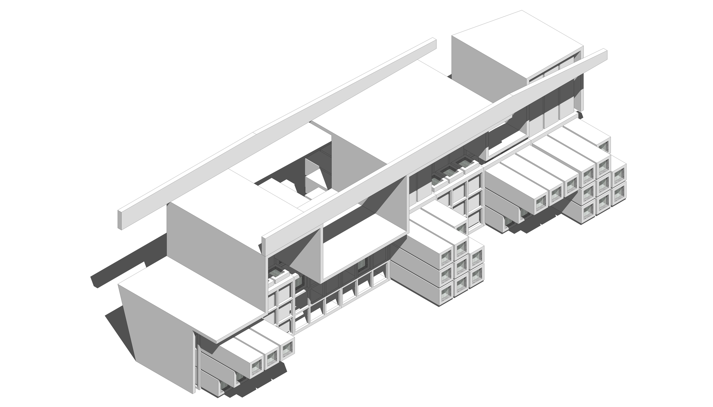
Exploded axonometric view showing the Grid and the modules.
Cube Museum I – Museo Cubo I

This exercise focuses on transformation and how a cube grid can house a transformative system. The Cube is present with a 3d grid and a series of “bars” composed of 3 cubes 80cms in height. This bars slide and become stairs, benches, exhibition surfaces etc. this bars can slide form 3 sides of the cube to change the space inside.

To test this three-dimensional gizmo, it needs to be inserted and proven with an open and free flowing functional program.  

Thus a museum was chosen to use the gizmo. Several cubic gizmos where arranged in a linear fashion to create a linear path to exhibit the works. The gizmo can be changed so the exhibition space can change depending on which type of exhibition is chosen. The gizmo is open so an enclosure needed to be designed in order to make a semi-dry space.
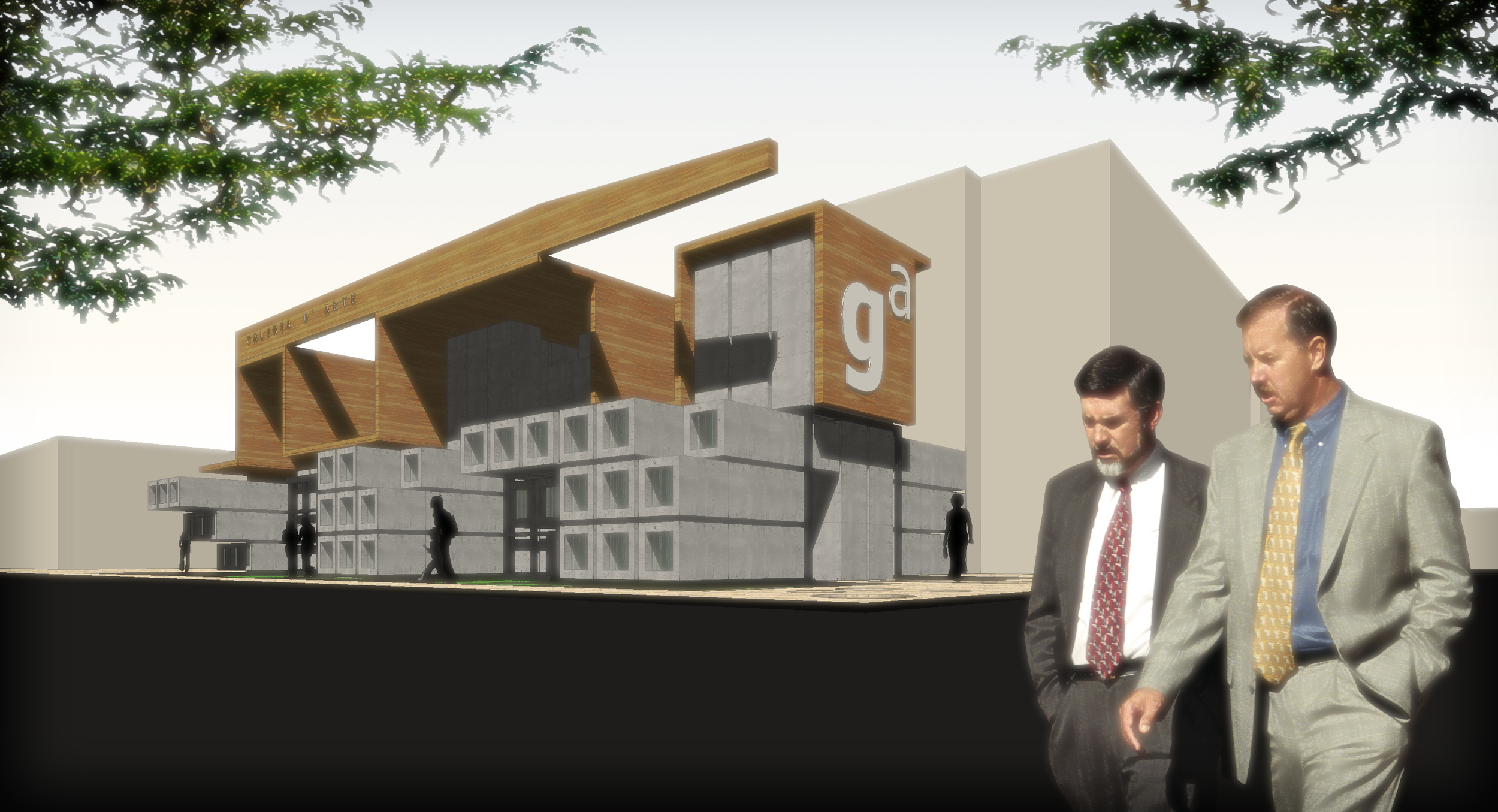
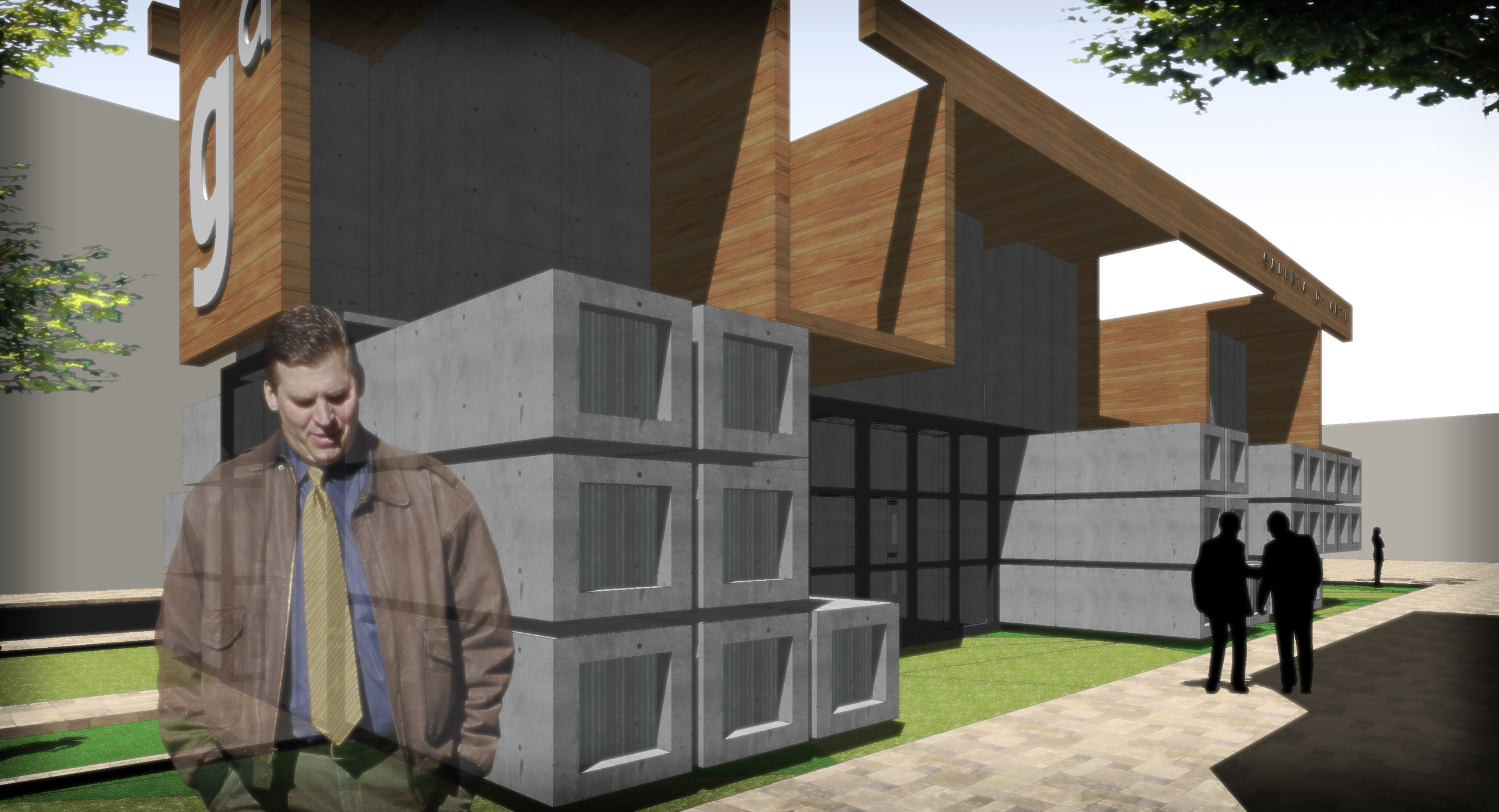
The resulting design is a museum open space that can change depending on the exhibit. It is a free-flow transformative form and space.

Minimal House - Casa Mínima

Cubo2.jpg

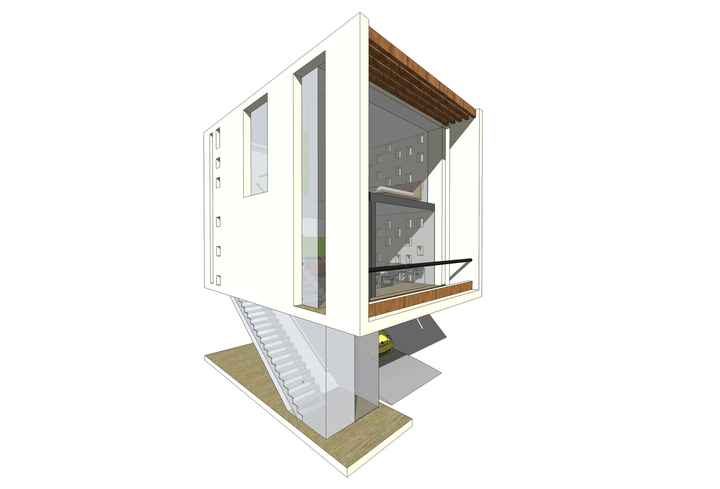
This excersise focused on creating a very small living unit using modern design concepts and materials. This excersise is part of the Cube series (more on future posts) so it had to be housed inside a cube like structure.

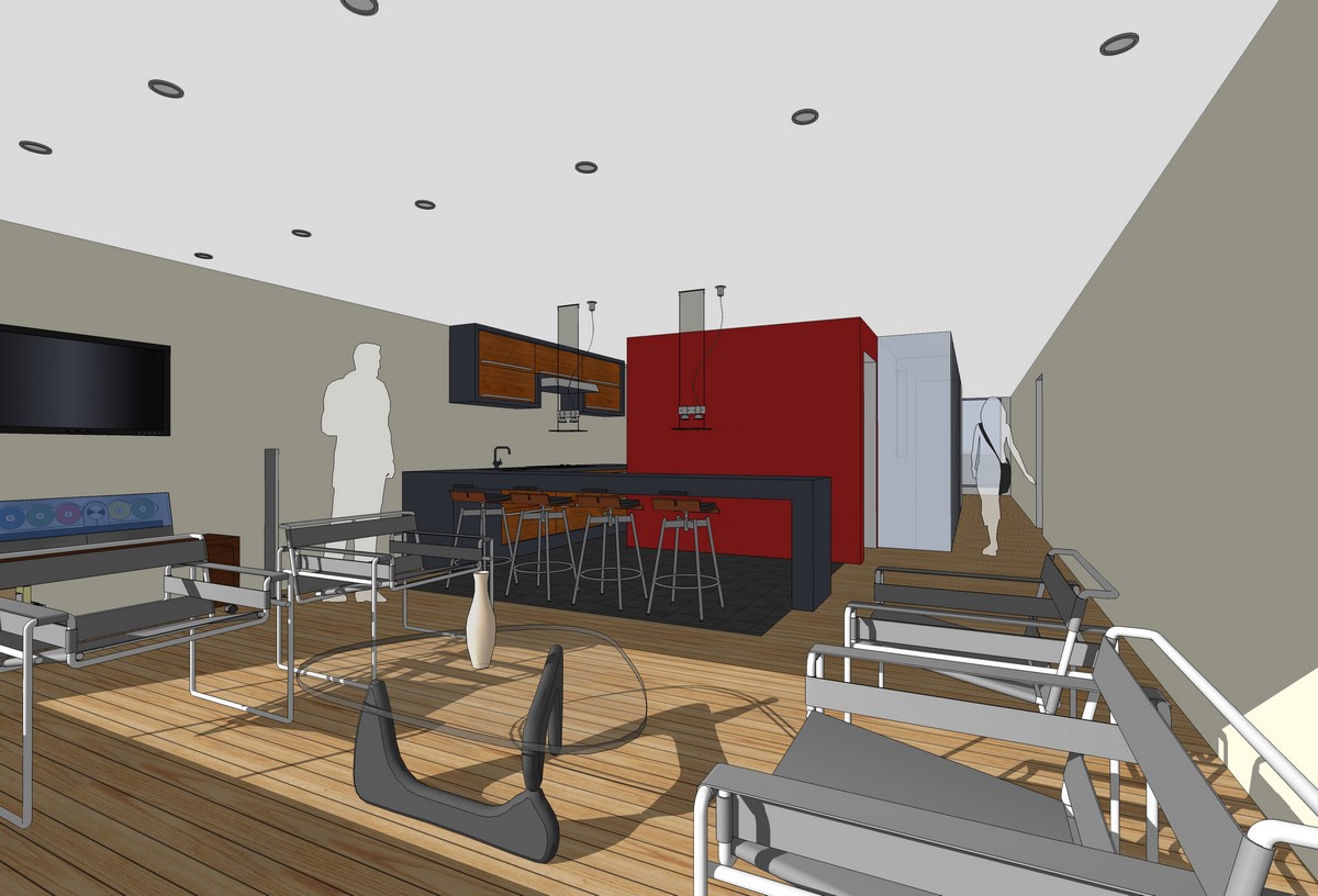
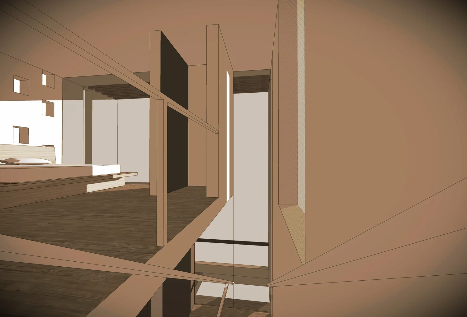
The house has a parking space (for a car, bikes or a boat), on the first floor. The second floor has the social area and has a balcony, a living room and an open kitchen with a bar. The third floor has the provate areas so it has 1 bedroom and a full bathroom that can also be used for guests.

This house is a consmopolitan modern loft that can even be movable and transportable.